Apple’s iOS 10
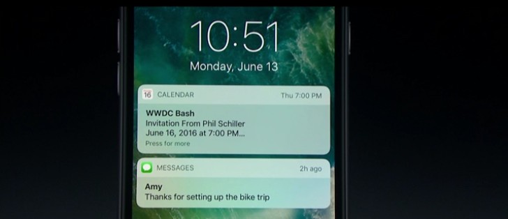
The recent debacle between the Apple and the FBI, gained the company lot of accolades for its focus on privacy. For some reason, though, Apple decided to undo that. Sure, the lock screen has a lot of information now, but doesn’t that kill the whole point? My work emails are out there in the open, for anyone to read, as are other texts and WhatsApp messages. The fact that you can reply to texts from the lock screen remains, as it was in the earlier iOS version, a mistake.

In addition more options to things you can do with the lock screen notifications, Apple has added a step. You now have to swipe the notification, click View/Clear and then interact with the options that show up. This is meaningless when the app you get a notification from doesn’t offer any more options. The notifications take up a lot of space as well, showing little information in comparison. When you have a lot of notifications, you’ll be scrolling till kingdom come.
The widgets menu on the lock screen also makes little sense to me. Widgets, if at all needed, need to be at a place where they’re in front of you. Isn’t that the whole point of them? If you have to swipe the screen to get to widgets, it doesn’t really make sense.
Also See: What's new in Messages and FaceTime on iOS 12 Review
Lastly, almost all of the interaction on the lock screen depends on swiping left or right. You swipe right left on a notification to see the View/Clear options (which have small fonts on huge buttons), and you swipe left on a notification to open it directly from the lock screen. Incidentally, you also swipe left to open the camera, and swipe right to get to the widgets menu. As a result, you’ll often end up on the widgets menu or camera, when you meant to do something else.
The worst app Apple has ever made
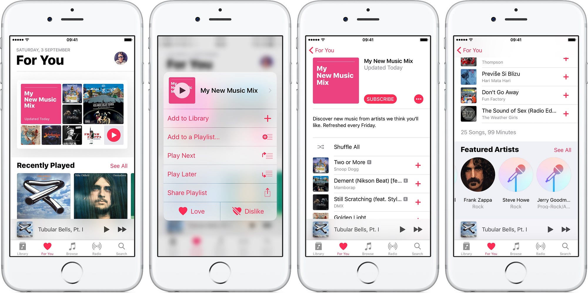
I’m talking about Apple Music of course. Apple’s streaming service and music app was already far too cluttered, and offered little by way of usability. Frankly, the new big and bold design doesn’t solve any purpose once again. It’s perhaps the first time you see Apple making changes for the sake of changing.

Library, For You and other sections are mentioned in bold letters, using up a lot of space on the screen. The question is, if I clicked the Library, don’t I already know I’m there? Why does it need to be mentioned in such huge bold characters? As a result of this, the information on the various tabs are precious little. For You now depends on sideward swipes to show you more playlists, but nothing about them. If you scroll down, you’ll quickly get to the Connect tab, which remains useless. Apple has made album art and fonts bigger, and compromised information for that.
Moreover, you need more taps to do almost everything in the app, from liking a song to downloading it. By the way, there’s no way to download a playlist right off the Search screen. You’ll have to actually play it and then get the download button. I unsubscribed to Apple Music last time for how bad the Android app was, with the iOS app in this state, I have little reason to ever come back.
Control Center
What was Apple thinking here? I’ve not use Night Shift even once, but I have to deal with a huge button on the Control Center. I hate that I need an extra swipe to access music controls, and the wasted space on the control center irks me. Apple really wants people to use Night Shift, because there’s really no other reason that I can think of, for it to be there.

Other issues
I wish that was the end of what’s wrong with iOS 10. The Spotlight Search screen is literally a repetition of the Widgets Menu on the lock screen, and it’s also repeated via a left swipe on the Notifications drop down. The additions in iOS 10 are literally being forced upon us.
Further, the new messaging app is not meant for Indian users, most of whom are barely texting anymore. Apple wants to add scribbles, images, and sharing music to Messaging, but I doubt anyone’s going to use that in India. Doesn’t everyone use WhatsApp or other IMs nowadays? Apple has cut the size of the text bar to add icons (again too big) to the Messaging app. If you're getting messages from services like Zomato, they include previews, and these never really load seamlessly. They also take up enough space to push one who text out of the screen. As a result, an IPhone SE shows at best two Zomato texts at a time.
What do we learn from iOS 10?
Apple's iPhones have pretty much had the same design for the past two or three years, and its software hasn't improved much either. While no one can argue with iOS' prowess in managing resources on phones, from an usability point of view, iOS 10 is perhaps the worst I've seen in a long time. It looks better on an iPad, but if you're using the smallest of Apple's phones (iPhone SE or iPhone 5S), you're in for a tough time. As big as the notifications are, you'll get a maximum of four notifications on the lockscreen, or notifications drop down, which is just sad. Most of the additions are useless, and there's little sense in them being there. In fact, looking at iOS 10, it seems Apple is done with small phones. The new OS is not good for any of its devices, but it at least makes more sense on bigger screens.


Post a Comment