

Also See: Best 3 features to know about upcoming itel A62 smartphone
Spotted by Thurrott on Tuesday, the new version of Canary features a wide range of changes. A Google evangelist on Google+ announced that the latest Canary update would include the following changes: “tab shape, single tab mode, omnibox suggestion icons, tab strip coloring, pinned tabs, and alert indicators.”
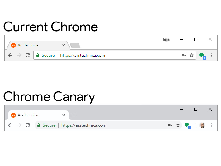
While Google has adjusted the UI for Chrome in the past, the new look in Canary might be the most significant design overhaul since Chrome launched in 2008. As you can likely tell from the sliver of an image below, virtually every major element of the Chrome UI, from tabs to buttons, has been updated:

On one hand, Chrome has been overdue for a redesign for years, but this might take some getting used to for the millions of users who surf the internet on Google’s browser day in and day out. The good news is that you can start acclimating yourself to the update right now by downloading Chrome Canary, where the refreshed UI is already turned on by default on Windows, Linux, and Chrome OS. Just jump right in.
If you’re on Mac and can’t see the design, try setting experimental flags chrome://flags/#top-chrome-md to “Refresh” and enable chrome://flags/#views-browser-windows. Type those two strings into the search bar at the top of your browser and you’ll be automatically redirected to the page where you can change the settings.
Post a Comment